This week I dove into the vibrant world of color psychology and its powerful influence on visual storytelling. Through my research and work, I began to see color not just as a design tool, but as an emotional language that speaks directly to our instincts, memories, and moods.
I explored several insightful articles that deepened my understanding of how we interact with color. According to The Hustle by HubSpot, color can influence everything from our buying behavior to how we feel in a space. It is no wonder major brands spend so much time refining their palettes. Similarly, Smashing Magazine reminds us that color is both cultural and contextual. It holds different meanings depending on time, place, and audience. What might feel calm and serene to one, could evoke sadness or distance in another.
Building on these ideas, I turned to 99designs’ guide to color theory, which breaks color relationships into easy-to-understand systems such as monochromatic, complementary, and triadic. These schemes are not just aesthetic choices; they carry rhythm and emotion. I found this especially helpful as I began working on a poster inspired by Milton Glaser’s iconic aesthetic.
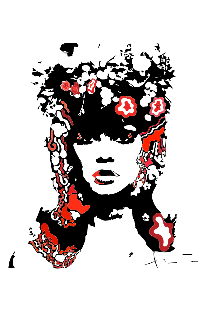
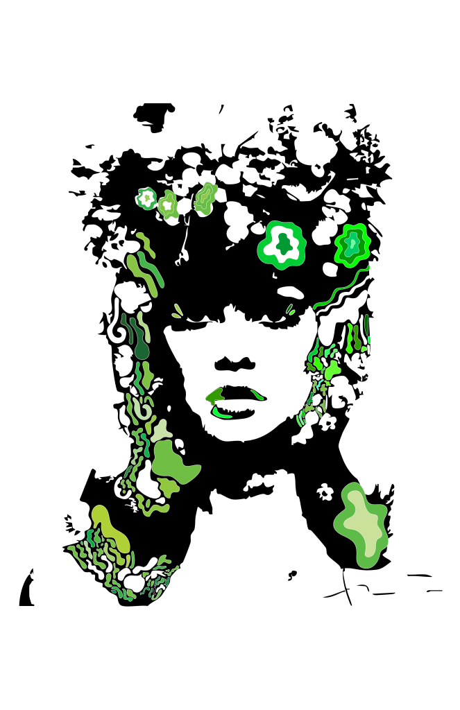
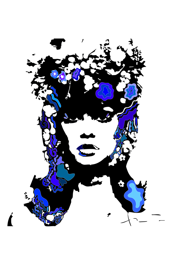
Milton Glaser’s work, known for its bold use of color and hand-drawn forms, felt like the perfect exploration to color psychology. For this week’s assignment, I created a series of posters showing a woman with flowers in her hair. This image serves as an homage to both Glaser’s era and my own branding project, Lily & Vine, a modern flower shop and workshop space. I started with red hues to evoke passion and confidence, moved into greens to reflect growth and freshness, and finished with blues to suggest calm, trust, and introspection.
Each poster is a study in how color can shift a mood, even when the composition stays the same. Red electrifies the piece, making it bold and energetic. Green introduces harmony and natural balance. Blue brings a quieter, cooler emotional tone. As HubSpot highlights, “color isn’t just what something looks like—it’s how it makes you feel.” That sentiment stayed with me throughout this project.
What I love most about this process is that it allowed for freedom and play. I drew each shape with Illustrator’s pencil tool, letting the lines flow naturally before filling them in with layered hues and outlines. It was a meditative experience, almost like coloring outside the lines on purpose. That sense of creative freedom is something Glaser championed, and I hope it comes through in my work.
As I continue building out the Lily & Vine brand, this exploration of color psychology will stay at the heart of every decision. Whether I am designing packaging, signage, or digital materials, I now understand that color choices go far beyond preference. They shape how people connect with a brand on a gut level.
Citations
HubSpot. (2022). The Psychology of Color: How to Use Color to Increase Conversion Rates. The Hustle. https://blog.hubspot.com/the-hustle/psychology-of-color
Smashing Magazine. (2010). Color Theory For Designers, Part 1: The Meaning of Color. https://www.smashingmagazine.com/2010/01/color-theory-for-designers-part-1-the-meaning-of-color
99designs. (n.d.). The 7-Step Guide to Understanding Color Theory. https://99designs.com/blog/tips/the-7-step-guide-to-understanding-color-theory/
