For my final design project, I chose to rebrand Lily & Vine, a boutique floral studio located just outside of downtown Torrington, Connecticut. The business is based in a beautifully restored 1800s building and is known for creating elegant, thoughtful floral arrangements. Over time, Lily & Vine has expanded its services to include creative workshops and floral education. My goal with this rebrand was to develop a visual and verbal identity that reflects this shift and aligns with the studio’s evolving mission.
Building on the Past
The original Lily & Vine brand had a rustic charm and felt cozy and welcoming. However, the visual identity lacked cohesion, and the tone was informal and undefined. There was a clear disconnect between the look and feel of the brand and the elevated, experience-focused direction the studio was taking.
This redesign was created to bridge that gap. I wanted to develop a cohesive identity that feels warm, modern, and grounded in craftsmanship. The new system better communicates the artistic and educational goals of Lily & Vine while supporting growth into new offerings and a broader audience.
Understanding the Audience
Lily & Vine’s primary audience includes women aged twenty-five to sixty-five with a strong interest in creativity, floral design, and DIY projects. This group values authenticity, aesthetics, and hands-on learning. They are likely to engage with both in-person and online content, and they appreciate a brand experience that is both personal and polished.
Through research, I learned that this audience gravitates toward soft and earthy color palettes, elegant serif fonts, clean layouts, and warm, natural photography. These preferences strongly influenced both the verbal and visual direction of the brand.
Competitive Research
To better understand industry standards and opportunities for differentiation, I analyzed four floral brands with distinct identities:
Koko Flora uses a modern serif and minimal layout to create a calm and nurturing presence.
Bloom Bar features playful serif typography and spacious design to convey a boutique-inspired, cheerful tone.
She Loves Me blends vintage style with modern energy, using collage-style layouts and nostalgic typography.
Flower Girl NYC feels bold and editorial, using dramatic photography and high-contrast serif type to establish a refined, fashion-forward identity.
Each brand had strengths that informed my choices for Lily & Vine, particularly around tone, type hierarchy, and layout structure.
Introducing the New Brand
The name Lily & Vine remains unchanged. The new slogan is “Elegant arrangements. Creative community.” The brand story focuses on the studio’s evolution into a space that supports both floral artistry and education. Core values include creativity, craftsmanship, sustainability, community, and shared learning.
The brand voice is warm, descriptive, and encouraging. The style of language is sensory and metaphorical, designed to help readers connect emotionally while still offering clarity.
The logo system includes a primary serif wordmark and a simplified icon featuring a vintage Volkswagen van. This detail nods to the brand’s creative spirit and adds a recognizable visual element. The color palette includes seasonal shades with clearly defined primary and accent hues. HEX, RGB, and CMYK values are provided for consistency across platforms.
Typography includes Fraunces for headings, tt Chocolates for subheadings, and Cormorant Garamond for body text. The hierarchy ensures clarity across digital and print materials.
Bringing the Brand to Life
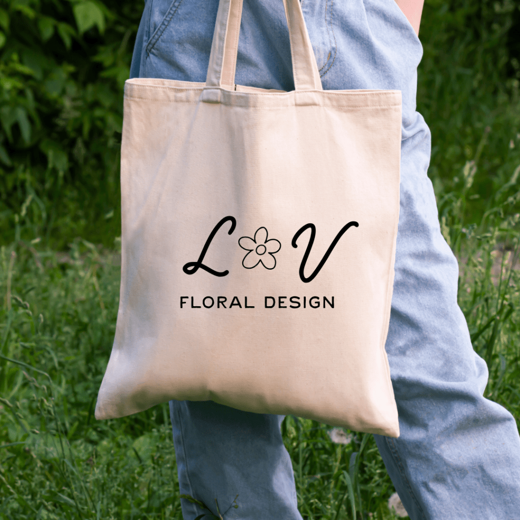
The business identity system includes four key items. A canvas tote with the logo serves as a functional and beautiful workshop accessory. A hat embroidered with the brand name offers a casual, lifestyle-friendly touchpoint. A thank you card with the phrase “Your next favorite hobby starts here” adds a personal and inviting message. A ceramic mug featuring the illustrated van reinforces the brand’s charm and story.
The event poster uses the full visual identity to promote workshops with clarity and impact. It features brand photography, serif type, and structured layout that invites the viewer to explore.
The trifold brochure presents workshop offerings, studio information, and floral imagery in a clean and consistent design. It is formatted for easy distribution and aligns with the tone of the overall brand.
The email newsletter reinforces connection with the studio’s community. It includes workshop dates, floral tips, and new offerings in a clean, brand-aligned format. Its tone is warm, educational, and encouraging. The website comps also reflect the updated brand. The homepage includes visual storytelling, clear calls to action, and a refined layout to reflect the studio’s elevated approach.
Final Thoughts
This project repositions Lily & Vine as a floral brand rooted in creativity, education, and intentional design. From logo and language to color palette and product packaging, each element supports a clear, meaningful identity. This rebrand honors the studio’s past while building a flexible foundation for future growth.

Leave a comment