For my final design project, I chose to rebrand Lily & Vine, a boutique floral studio located just outside downtown Torrington, Connecticut. Housed in a beautifully restored 1800s building, Lily & Vine offers thoughtfully designed floral arrangements and recently expanded into floral education through community workshops. The brand has grown from a cozy flower shop into a place where artistry and learning meet—and it needed a refreshed identity to reflect that evolution.
The existing brand carried a rustic charm, but visually and verbally, it lacked cohesion. It didn’t quite capture the studio’s current offerings or its elevated, modern aesthetic. My goal was to redesign Lily & Vine with intention—to create a brand that felt elegant yet accessible, rooted in craftsmanship, and aligned with the studio’s new focus on experiential learning and community connection.
This rebrand touches every part of Lily & Vine’s identity, from its typography and logo system to its tone of voice, photography, and digital presence. I began by studying what resonated with the studio’s audience: women ages 25 to 65 with interests in DIY, wedding planning, creative hobbies, and supporting local businesses. This group gravitates toward soft, earthy tones, romantic serif fonts, and clean, minimal layouts that still feel personal and expressive.
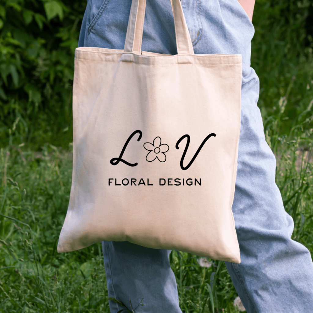
Informed by audience research and a deep dive into competitors such as Koko Flora, The Bloom Bar, She Loves Me, and Flower Girl NYC, I created a brand system that blends structure with softness. The new visual identity features an elegant serif logo with alternate marks for flexibility across platforms. The color palette is warm and seasonal, inspired by natural light, petals, and garden soil. For typography, I chose a refined type hierarchy that uses Fraunces and Cormorant Garamond to convey sophistication, paired with tt Chocolates for subtle contrast and readability.
The verbal brand brings the same sense of care and clarity. Lily & Vine now speaks in a voice that is descriptive, calm, and inviting—balancing education with creativity. The tagline “Elegant arrangements. Creative community.” captures the heart of the brand. Its messaging focuses on storytelling, seasonal inspiration, and making design feel approachable.
To bring the brand to life, I developed a full business identity system including business cards, thank-you notes, and event materials. I also created a trifold brochure, newsletter, event poster, and website comps to show how the visual and verbal brand extend across real-world and digital touchpoints. Each piece is designed to feel unified, personal, and elevated—just like the Lily & Vine experience.
This project has been a chance to explore branding not just as a design challenge, but as a way of capturing and sharing a story. For Lily & Vine, that story is about growth, artistry, and the joy of learning something new.

Leave a comment