Discover how the typography in vintage makeup ads mirrored changing societal views of femininity, influencing beauty standards and shaping modern advertising strategies in the beauty industry.
Linkedin Creative


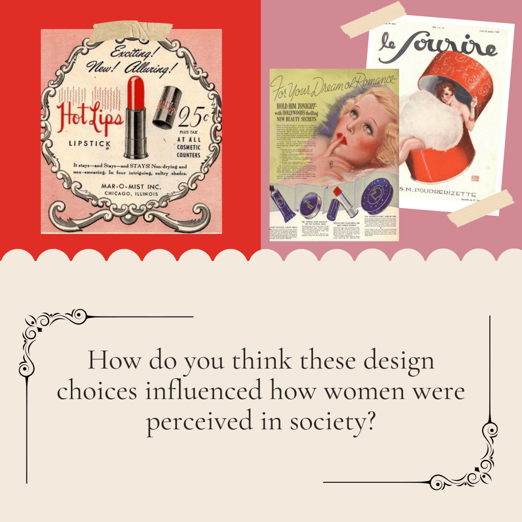
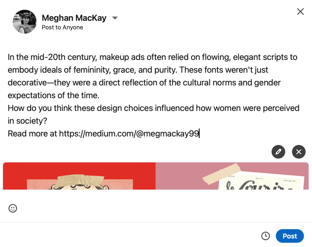
Caption: In the mid-20th century, makeup ads often relied on flowing, elegant scripts to embody ideals of femininity, grace, and purity. These fonts weren’t just decorative—they were a direct reflection of the cultural norms and gender expectations of the time. How do you think these design choices influenced how women were perceived in society?
For LinkedIn, I’ve found that many marketing professionals choose call-to-actions to increase engagement within their professional community, which is why I’ve incorporated a thought-provoking question to spark conversation and invite others to share their insights.
Instagram Creative

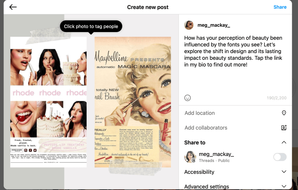
Caption: How has your perception of beauty been influenced by the fonts you see? Let’s explore the shift in design and its lasting impact on beauty standards. https://medium.com/@megmackay99
Facebook and Instagram reach a much broader audience, from beauty enthusiasts to design lovers, as well as industry professionals. My goal here is to create content that’s visually appealing and thought-provoking, engaging a wider range of people.
X Creative

Caption: How have your views on femininity been influenced by these fonts? Read the full article on https://medium.com/@megmackay99
The goal here is to spark a conversation about how typography in beauty ads shapes our views of femininity. Since X and Threads platforms are fast-paced with short attention spans from audiences, I kept the caption short and direct, aiming to provoke thought and encourage engagement, especially with the question at the end.
Leave a comment